• Welcome to the Muppet Central Forum!
    You are viewing our forum as a guest. Join our free community to post topics and start private conversations. Please contact us if you need help.
  • Christmas Music
    Our 24th annual Christmas Music Merrython is underway on Muppet Central Radio. Listen to the best Muppet Christmas music of all-time through December 25.
  • Macy's Thanksgiving Parade
    Let us know your thoughts on the Sesame Street appearance at the annual Macy's Parade.
  • Jim Henson Idea Man
    Remember the life. Honor the legacy. Inspire your soul. The new Jim Henson documentary "Idea Man" is now streaming exclusively on Disney+.
  • Back to the Rock Season 2
    Fraggle Rock Back to the Rock Season 2 has premiered on AppleTV+. Watch the anticipated new season and let us know your thoughts.
  • Bear arrives on Disney+
    The beloved series has been off the air for the past 15 years. Now all four seasons are finally available for a whole new generation.
  • Sam and Friends Book
    Read our review of the long-awaited book, "Sam and Friends - The Story of Jim Henson's First Television Show" by Muppet Historian Craig Shemin.

Disney's New Muppets Logo

Drtooth

Well-Known Member
Joined
Apr 16, 2002
Messages
31,717
Reaction score
6,710
We've had it for 2 years now, I don't see why there really needs to be much more discussion on the matter. It's an okay logo. It's okay for the minimalistic look they're going for in merchandising, I guess. But it just makes me thing of this...

We really liked the first couple series of Muppet Show action figure packaging


Then the packaging changed to a more modern


Brand unity, maybe, since all other Muppet merchandise had that uniform angular lines and blue (which has nothing Muppety about it). It looks good, but nothing can compare to the curtain packaging.


Now we move all the way on to Disney's Muppet merchandise... I can't find any really good examples, but they're all white with the tops of character heads popping out. It's cute, if mininmalistic, but it's not very visually appealing other than a basic level. That's where the logo works (unfortunately)

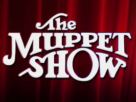
I don't see why Disney just doesn't go full blown nostalgia and do the red curtain motif with the original show Type Font.
 

Bridget

Well-Known Member
Joined
Jan 7, 2013
Messages
764
Reaction score
536
Hehe, get out of your box Reevz! I see your point, and I think I am beginning to change my mind. By the way, you're pretty funny man. :smile:
 

jvcarroll

Well-Known Member
Joined
Mar 27, 2012
Messages
1,660
Reaction score
1,999
Let's face it, branding is tough. The Muppets already have the die-hard fans and we'll be attracted to the merchandise no matter what the label looks like. Here's Disney's challenge:
  • Distinguish the Muppets brand from Henson and Sesame Street
  • Make it look new, fresh and bold
  • Work-in the Disney brand
  • Possibly work-in Kermit and/or Muppet imagery
  • New branded colors for advertising
  • Possibly create a recognizable emblem element
The imagery on the left indicates some of Disney's attempts in recent years. The right shows Henson and Disney's more successful attempts at updating the logo. I'd argue that the right hand side's second logo down is the most successful typography update. It would look great with bolder colors, possibly red and yellow.

I understand the intent of this recent Kermit "M" Muppets logo and it probably does help establish Disney's Muppet brand as the one with Kermit, Piggy and the gang. It was also kind of a "guess who's back" sort of campaign. I just think it's time to move on. Get some of the serifs back and thicken-up the letters.


In other words, if they are going to M-update the logo, I favor something somewhat closer to this...
Just my two cents.​
 

Reevz1977

Well-Known Member
Joined
Jul 27, 2007
Messages
1,138
Reaction score
374
Let's face it, branding is tough. The Muppets already have the die-hard fans and we'll be attracted to the merchandise no matter what the label looks like. Here's Disney's challenge:
  • Distinguish the Muppets brand from Henson and Sesame Street
  • Make it look new, fresh and bold
  • Work-in the Disney brand
  • Possibly work-in Kermit and/or Muppet imagery
  • New branded colors for advertising
  • Possibly create a recognizable emblem element
The imagery on the left indicates some of Disney's attempts in recent years. The right shows Henson and Disney's more successful attempts at updating the logo. I'd argue that the right hand side's second logo down is the most successful typography update. It would look great with bolder colors, possibly red and yellow.

I understand the intent of this recent Kermit "M" Muppets logo and it probably does help establish Disney's Muppet brand as the one with Kermit, Piggy and the gang. I just think it's time to move on. Get some of the serifs back and thicken-up the letters.


In other words, if they are going to M-update the logo, I favor something somewhat closer to this...
Just my two cents.​
EXACTLY!!!
 

jvcarroll

Well-Known Member
Joined
Mar 27, 2012
Messages
1,660
Reaction score
1,999
EXACTLY!!!
I understand why Disney doesn't want the logo to appear vintage, but there are so many ways around that.

I was one of the few that didn't like the original Palisades packaging because the colors were a little too dark and dingy and the Muppet Show logo was overly Photoshopped with gradients and bevels.

Instead of going to the blue and green, I would have kept a red curtain element yet placed it cleanly against white or a clean neutral. That would have made the figures pop from the packaging rather than fade into it. I would have also used a bolder, non-gradient version of their Muppets typography.

Of course all of this came from Henson's licensing art and branding book so Palisades had very little to do with such decisions. Still, my point is that something can still be both fresh and classic. Disney should know that better than anyone else. I'm just waiting to see it in their advertising for the Muppets. It's slowly getting better.
 

Drtooth

Well-Known Member
Joined
Apr 16, 2002
Messages
31,717
Reaction score
6,710
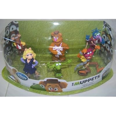
I wish I had an example of the packaging they have for the movie related merchandise. But I opened my figure set and tossed the packaging away (though I liked the interior with Muppet eyes, but that could have been done so much better), and I didn't get a chance to get the Valentines last year. I really don't see why they're going with such minimalism. Surely the characters pop out, but anything pops out with bland imagery.

Of course, the Theme Park version of the figure set...


Other than the ugly google eyed P and the anachronistic Gonzo poser photoshopped in the picture, there's some potential to this sort of thing. At least, more so than the blank white with the current green M black Uppets logo. I think that big hole in the brick wall is kinda fun.

I just want to see some evolution when the next movie comes around. Something a lot more playful than what we're getting.
 

jvcarroll

Well-Known Member
Joined
Mar 27, 2012
Messages
1,660
Reaction score
1,999
I wish I had an example of the packaging they have for the movie related merchandise. But I opened my figure set and tossed the packaging away (though I liked the interior with Muppet eyes, but that could have been done so much better), and I didn't get a chance to get the Valentines last year. I really don't see why they're going with such minimalism. Surely the characters pop out, but anything pops out with bland imagery.

Of course, the Theme Park version of the figure set...


Other than the ugly google eyed P and the anachronistic Gonzo poser photoshopped in the picture, there's some potential to this sort of thing. At least, more so than the blank white with the current green M black Uppets logo. I think that big hole in the brick wall is kinda fun.​
I just want to see some evolution when the next movie comes around. Something a lot more playful than what we're getting.​
Here's the other branding of the same set. I'm just not keen on the current licensing and branding book they have on the Muppets right now. It's either cluttered or blah. Maybe they should do a contest!​
 

muppetlover123

Well-Known Member
Joined
Jul 23, 2010
Messages
3,393
Reaction score
1,213
i kind of like the whole M thing but its going to be really weird with the Logo like this for the new movie...

The Muppets ... Again on every single piece of merchandise and on the dvd cover too
 

Drtooth

Well-Known Member
Joined
Apr 16, 2002
Messages
31,717
Reaction score
6,710
That's the hard thing with the first title. You can't tell if it was the entire brand or just the name of the movie. I'd tend to think only movie specific stuff, like kiddy book adaptions, would have the ...Again byline.

Here's the other branding of the same set. I'm just not keen on the current licensing and branding book they have on the Muppets right now. It's either cluttered or blah. Maybe they should do a contest!​
I give them credit for one thing, though. New posers. They just use them inconsistently with the stale old Gonzo in a pepper shirt/air kissing Chef images. At least the Kermit isn't as terrible as it was years ago.
 
Top