Welcome to the Muppet Central Forum!
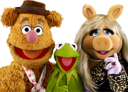 FIFA World Cup 2026 Final Halftime Show
 Sesame Street Classics on YouTube
 Sesame Street debuts on Netflix
 Back to the Rock Season 2
 Sam and Friends Book
 Jim Henson Idea Man
 Bear arrives on Disney+
We've had it for 2 years now, I don't see why there really needs to be much more discussion on the matter. It's an okay logo. It's okay for the minimalistic look they're going for in merchandising, I guess. But it just makes me thing of this...
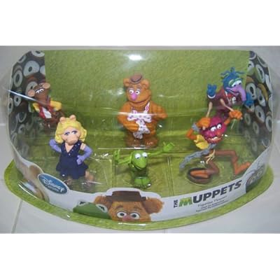
We really liked the first couple series of Muppet Show action figure packaging

Then the packaging changed to a more modern

Brand unity, maybe, since all other Muppet merchandise had that uniform angular lines and blue (which has nothing Muppety about it). It looks good, but nothing can compare to the curtain packaging.
Now we move all the way on to Disney's Muppet merchandise... I can't find any really good examples, but they're all white with the tops of character heads popping out. It's cute, if mininmalistic, but it's not very visually appealing other than a basic level. That's where the logo works (unfortunately)
I don't see why Disney just doesn't go full blown nostalgia and do the red curtain motif with the original show Type Font.
We really liked the first couple series of Muppet Show action figure packaging
Then the packaging changed to a more modern
Brand unity, maybe, since all other Muppet merchandise had that uniform angular lines and blue (which has nothing Muppety about it). It looks good, but nothing can compare to the curtain packaging.
Now we move all the way on to Disney's Muppet merchandise... I can't find any really good examples, but they're all white with the tops of character heads popping out. It's cute, if mininmalistic, but it's not very visually appealing other than a basic level. That's where the logo works (unfortunately)
I don't see why Disney just doesn't go full blown nostalgia and do the red curtain motif with the original show Type Font.