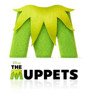
Disney's New Muppets Logo

Reevz1977

Well-Known Member
Joined
Jul 27, 2007
Messages
1,138
Reaction score
374
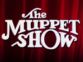
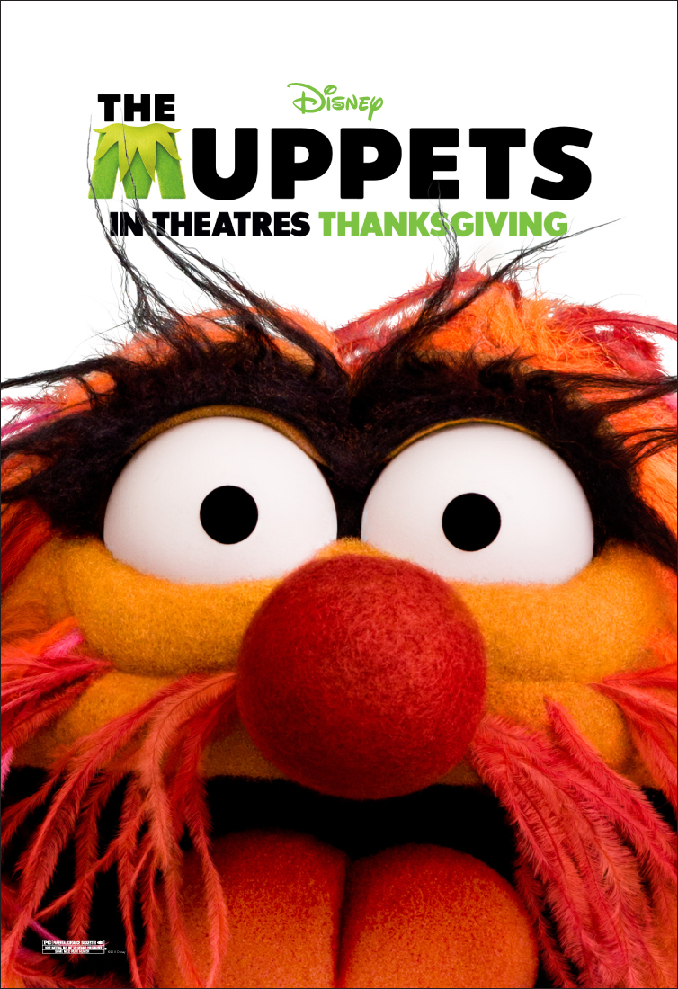
I think the logo is cute
That's EXACTLY the reason I hate it, it is really cute. The Muppets were never cute. Their appearance was never cute, their behaviour was never cute, nothing about them was cute. I think that is fundamentally the reason Disney does not understand the Muppets. In their big pupiled, perfect appearance, saccharin filled world, Disney are the experts on cute...with little understanding for anything that's slightly off. You could even argue the more recent puppet builds are a perfect example of this, as the Muppets have never looked more "perfect". Fozzies hair is no longer mangy or matted (Disney claim they couldn't find the right fur but this is bull - heat treatments on existing fur would give Fozzie his original appearance) and Crazy Harry could very well have his name changed to "slightly off kilter, but nicely groomed Harry". The Muppet Babies were the cute element of the Muppets.

That said, you are a 1000000% right, the logo is cute.
 

Sgt Floyd

Well-Known Member
Joined
Feb 5, 2006
Messages
27,870
Reaction score
2,540
I'd disagree that it's cute, but meh...I'm more surprised that this thread was revived and we are still arguing about the logo XD
 

Reevz1977

Well-Known Member
Joined
Jul 27, 2007
Messages
1,138
Reaction score
374
I'd disagree that it's cute, but meh...I'm more surprised that this thread was revived and we are still arguing about the logo XD
Under that logic, it's well past the time that people should stop discussing the artistic merits of the great artists :wink:

Thinking about that, can you imagine what Da Vinci's blog would have been like..."I had a lady sit for me today - man, what a sour-puss!"
 

Drtooth

Well-Known Member
Joined
Apr 16, 2002
Messages
31,717
Reaction score
6,706
That's EXACTLY the reason I hate it, it is really cute. The Muppets were never cute. Their appearance was never cute, their behaviour was never cute, nothing about them was cute. I think that is fundamentally the reason Disney does not understand the Muppets.
I don't really see cute. Cuteness of concept, but I don't think it's playful enough to warrant a cute. It's a straight faced, overly groomed business man wearing a Santa Claus tie the Christmas he decides to work at the office because he's in almost a jovial mood. It reminds me more of Eek the Cat's Steven Squirrel, specifically their boring "celebrations." "We went a little crazy on the Fourth of July. We are dressed up as fire crackers. There's Halley and Acorn, Steven Junior, Gunter, and Thhhhuuuthan." That's what the logo looks like, blandness with a little sparkle that doesn't overshadow the blandness. Cute would be if all the letters looked like Muppet characters or were colored as such like the M was. It doesn't even have that level of whimsy.

Maybe there's just some movement in marketing (that transcends just Disney) to make things look clean, sterile, futuristic and minimalistic, and the Muppets logo is just supposed to be another one of those things. It looks hipsterish, actually. Meanwhile, all the Super Hero projects and products have that cross bred comic book title metallic look that's very dynamic and stands out. The only way the Muppet logo stands out is because they routinely put it against a blank white background. I agree with Jamie here... there's got to be a middle ground between baron and cluttered.
 

jvcarroll

Well-Known Member
Joined
Mar 27, 2012
Messages
1,660
Reaction score
1,999
I don't really see cute. Cuteness of concept, but I don't think it's playful enough to warrant a cute. It's a straight faced, overly groomed business man wearing a Santa Claus tie the Christmas he decides to work at the office because he's in almost a jovial mood. It reminds me more of Eek the Cat's Steven Squirrel, specifically their boring "celebrations." "We went a little crazy on the Fourth of July. We are dressed up as fire crackers. There's Halley and Acorn, Steven Junior, Gunter, and Thhhhuuuthan." That's what the logo looks like, blandness with a little sparkle that doesn't overshadow the blandness. Cute would be if all the letters looked like Muppet characters or were colored as such like the M was. It doesn't even have that level of whimsy.

Maybe there's just some movement in marketing (that transcends just Disney) to make things look clean, sterile, futuristic and minimalistic, and the Muppets logo is just supposed to be another one of those things. It looks hipsterish, actually. Meanwhile, all the Super Hero projects and products have that cross bred comic book title metallic look that's very dynamic and stands out. The only way the Muppet logo stands out is because they routinely put it against a blank white background. I agree with Jamie here... there's got to be a middle ground between baron and cluttered.
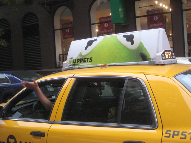
The film's advertising campaign has this sort of "peeking" or "guess who" sort of feel to it that the M kind of personified. I happened to like the Taxi signs, but the rest of it was kind of bland. They're officially back now, so I hope they go a different route this time.
 

Beauregard

Well-Known Member
Joined
Apr 16, 2002
Messages
19,240
Reaction score
1,239
The film's advertising campaign has this sort of "peeking" or "guess who" sort of feel to it that the M kind of personified. I happened to like the Taxi signs, but the rest of it was kind of bland. They're officially back now, so I hope they go a different route this time.
The taxis might go a different route, but they can still only take you as far as the lobby.
 
Top