Disney's New Muppets Logo

LouisTheOtter

Well-Known Member
Joined
Jan 25, 2012
Messages
326
Reaction score
512
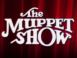
I think I could live with this logo, especially if it's just to promote the movie. That being said, I was absolutely delighted when the movie began and we saw the title done in the classic Muppet Show logo style.

But that makes me wonder: If Disney was happy to go old-school with the actual movie title (and all the signage for "The Muppet Telethon" in the film's second half), why didn't they use that lettering style to promote the actual movie, too?
 

Drtooth

Well-Known Member
Joined
Apr 16, 2002
Messages
31,717
Reaction score
6,706
I think I could live with this logo, especially if it's just to promote the movie. That being said, I was absolutely delighted when the movie began and we saw the title done in the classic Muppet Show logo style.

But that makes me wonder: If Disney was happy to go old-school with the actual movie title (and all the signage for "The Muppet Telethon" in the film's second half), why didn't they use that lettering style to promote the actual movie, too?
That's a VERY good question. One we'll probably wind up asking ourselves until someone stumbles upon some rumor or something third or fourth hand, so we'll never rightly know.

The Kermit M logo, I've learned to like, but I really think the classic Muppet Show logo for The Muppets would have looked more dynamic and give a sense of nostalgia needed to keep the franchise afloat.

I've noticed a lot of movies with opening titles that don't actually match the poster and promotional logos. Can't really think of them at the top of my head, though.
 

DannyRWW

Well-Known Member
Joined
Feb 6, 2005
Messages
1,040
Reaction score
400
Interesting thought about the movie logo. I wear a Muppet pin every day at work and one pin I got recently was the movie pin where it shows the logo and a couple heads peaking out. A student from a 4th grade class came up and saw my pin and asked what the Uppets were. She didn't seem to process the M right away. I don't know if it was the visual difference and maybe she thought the M was part of a picture instead? I don't personally mind the logo. But if it causes confusion for children that wouldn't be good.
 

Drtooth

Well-Known Member
Joined
Apr 16, 2002
Messages
31,717
Reaction score
6,706
Interesting thought about the movie logo. I wear a Muppet pin every day at work and one pin I got recently was the movie pin where it shows the logo and a couple heads peaking out. A student from a 4th grade class came up and saw my pin and asked what the Uppets were. She didn't seem to process the M right away. I don't know if it was the visual difference and maybe she thought the M was part of a picture instead? I don't personally mind the logo. But if it causes confusion for children that wouldn't be good.
Yeah, but how do you pronounce the "5" in Jackson 5ive? Jackson Fiveive? I've seen much worse... logos that share a single letter, ones with numbers that barely have resemblance to the letters they replace.

I don't see why just the M is stylized and the rest of the word is in plain font. Haven't then, haven't since.
 

Reevz1977

Well-Known Member
Joined
Jul 27, 2007
Messages
1,138
Reaction score
374
I've said it MANY (!!!) times before but I really dislike* the new logo. I was over the moon when I heard the new movie uses the old one and it's almost like the marketing people operated totally independently of the film which, in my very low opinion of the marketing* of "The Muppets", could very well be the case. All the director chairs on the set had the original Muppet logo, as did the scripts and finally the film itself opened with it - everything that supported Jason Segels old-school Muppets approach to the movie. The new logo was dumbed-down, uninspired, incredibly generic and downright awful. It would have been such a better move to modernise the already perfected look...but that's just my opinion.

*Understatement of 2012?

P.S. Sorry for my age-old rant, I just expected more! The film apparently delivers the goods, the marketing was absolutely....
 

frogboy4

Inactive Member
Joined
Apr 13, 2002
Messages
10,080
Reaction score
358
I've said it MANY (!!!) times before but I really dislike* the new logo. I was over the moon when I heard the new movie uses the old one and it's almost like the marketing people operated totally independently of the film which, in my very low opinion of the marketing* of "The Muppets", could very well be the case. All the director chairs on the set had the original Muppet logo, as did the scripts and finally the film itself opened with it - everything that supported Jason Segels old-school Muppets approach to the movie. The new logo was dumbed-down, uninspired, incredibly generic and downright awful. It would have been such a better move to modernise the already perfected look...but that's just my opinion.

*Understatement of 2012?

P.S. Sorry for my age-old rant, I just expected more! The film apparently delivers the goods, the marketing was absolutely....
I agree with you completely. I understand what they did and why they did it. They tried to attract a younger, faithful following by evoking Pixar with a Muppetized Monsters Inc "M" and a Toy Story configuration of colorful characters photographed against white. The marketing of the film worked, but it could have been handled so much better. Even the Photoshopped images were dragged-and-dropped without much skill or finesse. All that melted away when the Muppets appeared in ads and on screen, but what I would have given for a Struzan.
 

Drtooth

Well-Known Member
Joined
Apr 16, 2002
Messages
31,717
Reaction score
6,706
I agree with you completely. I understand what they did and why they did it. They tried to attract a younger, faithful following by evoking Pixar with a Muppetized Monsters Inc "M" and a Toy Story configuration of colorful characters photographed against white. The marketing of the film worked, but it could have been handled so much better. Even the Photoshopped images were dragged-and-dropped without much skill or finesse. All that melted away when the Muppets appeared in ads and on screen, but what I would have given for a Struzan.
Like I said, the beautifully illustrate, wonderfully crafted movie poster is a thing of the past. Sure, one pops up every so often, but for the most part it's cheesy photoshoots, CGI compilation poses, and stock art after stock art. It makes me wish Jason had a little more sway in marketing the film. The first trailer would have been much better done at any rate. Most movie posters look like crap now anyway. I'm guessing Disney went with inhouse people, leaving no room for outside artists with actual vision. Muppets aren't special there... other than their 2-D animated movies, it's all the same stuff I listed.

But the thing about the new logo is, it wasn't just for the movie... it's for the brand. Which means we're stuck with it until there's some sort of change in marketing. I still refuse to believe that any casual person would have liked a crummy minimalist approach to the logo vs. the actual film Muppet Show logo. This new logo looks pretty meh on merchandise. I miss the 25th anniversary Muppet merchandise look.
 

Reevz1977

Well-Known Member
Joined
Jul 27, 2007
Messages
1,138
Reaction score
374
I'm guessing Disney went with inhouse people, leaving no room for outside artists with actual vision. Muppets aren't special there... other than their 2-D animated movies, it's all the same stuff I listed.
Thats the REALLY sad part, if my mind serves me correctly, Disney used the same marketing people (FIVE33 and BLT & Associates) as they used for all the "Tangled", "Cars 2", "Toy Story 3" and "Alice In Wonderland" posters and marketing, which in my opinion were all absolutely fantastic!!! Between the two companies, they have produced some of the most memorable posters of recent years! Just want went wrong with this is anyones guess, I mean ask yourselves this, after seeing the movie, does the promo material emote the same feeling as the movie itself? Do they even feel in anyway connected??
 

CaseytheMuppet

Well-Known Member
Joined
Dec 28, 2010
Messages
2,623
Reaction score
1,160
I really dont think Jason had a say in what the logo looked like. I personally love the logo, but only for the movie. The classic logo should be used in upcoming merchandise.
 

Drtooth

Well-Known Member
Joined
Apr 16, 2002
Messages
31,717
Reaction score
6,706
Thats the REALLY sad part, if my mind serves me correctly, Disney used the same marketing people (FIVE33 and BLT & Associates) as they used for all the "Tangled", "Cars 2", "Toy Story 3" and "Alice In Wonderland" posters and marketing, which in my opinion were all absolutely fantastic!!! Between the two companies, they have produced some of the most memorable posters of recent years! Just want went wrong with this is anyones guess, I mean ask yourselves this, after seeing the movie, does the promo material emote the same feeling as the movie itself? Do they even feel in anyway connected??
Considering that this:


never happened in the movie, I'd agree.

They clearly have some separate live action marketing department... though I will say, the best Toy Story 3 posters were the ones that they released internationally... I never liked that Pokemon "gotta catch them all" jumbled character poster... I really didn't like the Muppet ones that they made to look exactly like that one (don't know why they even did that)...

The "closer than you think" one, while not all that great, managed to have something behind it... everything else was jumbled like those BAAAAD photoshop re-edits of old promotional photos with anachronistic and overly obscure characters in different lighting situations pasted in. If they ONLY gave the poster art to more capable hands, I'm sure we would have had just that much more interest.

But I give them credit for one thing... they didn't add in some TERRIBLE pun or misquoted reference to another movie in the tagline.
 
Top