Disney's New Muppets Logo

Beauregard

Well-Known Member
Joined
Apr 16, 2002
Messages
19,240
Reaction score
1,239
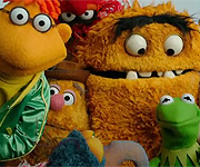
Uuuuuch...I'm looking at the "Jumbled Muppets" pic at the moment, because its on the Disney Store bags here in the UK (and on pillows, purses, notebooks and just about everything). And there are just so many issues with it...I can clearly see a small rat's hand behind Sam, and Gonzo's blue hair whisps sticking out of Animal's fingers...what on earth? Who did the photo-shopping on this project??? Between that and the headless-horsemen-Gonzo on the dvd cover, I do worry about the state of the marketing department at Disney...
 

Auberoun

Well-Known Member
Joined
Feb 10, 2012
Messages
59
Reaction score
52
Sorry for reviving this thread, but since I am new I wanted to "put in my $0.02".

I can sum it up in a simple phrase..."If it ain't broke, don't fix it."
 

Sgt Floyd

Well-Known Member
Joined
Feb 5, 2006
Messages
27,870
Reaction score
2,540
What I dont get is why they made the font black. They could easily have made it green, which would at least make it blend better. I'm not a fan of it, but in the long run, logos do not exactly make or break something
 

Bridget

Well-Known Member
Joined
Jan 7, 2013
Messages
764
Reaction score
536
Aw C'mon You Guys! Is it really that bad?
I mean sure, it's a little bit cleche that Kermit is the logo but I don't think it's that bad looking.
 

Reevz1977

Well-Known Member
Joined
Jul 27, 2007
Messages
1,138
Reaction score
374
Aw C'mon You Guys! Is it really that bad?
Yes, yes it is!! As a graphic designer, I see it as a lazy, ill-conceived, kiddyfied abomination thats been done to death. The "lets just change one letter and use a bland, generic, off-the-shelf font" has been done way too often and the Muppet brand already had a very well established style to it that could have easily been adapted. It lost all the edge(?) that past Muppet logo's have had and delivered something exceptionally bland - still, we're stuck with it :sympathy:

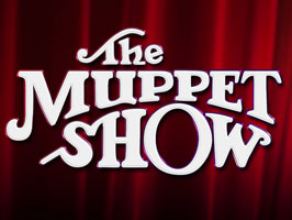
That said, I was over the moon they used the original title treatment for the opening of the Muppets!!!
 

Bridget

Well-Known Member
Joined
Jan 7, 2013
Messages
764
Reaction score
536
Hehe! Okay, Okay, Calm Down Animal! XD

I guess you sort of have a point there...

Wow! You really do have a point there. I didn't think about it that way...
 

Bridget

Well-Known Member
Joined
Jan 7, 2013
Messages
764
Reaction score
536
~Oh and by the way, I just checked out your art and you're amazing!
 

Reevz1977

Well-Known Member
Joined
Jul 27, 2007
Messages
1,138
Reaction score
374
~Oh and by the way, I just checked out your art and you're amazing!
Thank you very much!!! :flirt: That was done some time ago now and there's quite a few changes I intend to make...when I get chance.

Hehe! Okay, Okay, Calm Down Animal! XD

I guess you sort of have a point there...

Wow! You really do have a point there. I didn't think about it that way...
Sorry to go off on one:embarrassed:

With computers now readily available and design qualifications being handed out like flyers, the world is saturated with bad design and even worse "designers". Everyone with a copy of Word now thinks they are a Designer and sadly some of these people end up employed as one!!

The new Muppet logo really needed to keep the Serif look and almost "untidy" appearance as it kind of represents the characters...if that makes sense(??)

My opinionated view really comes from passion with regards to The Muppets. I see everything Disney does from two different angles, one as a fan and one as a "professional". The marketing department at Disney really don't seem to understand the Muppets and if you look at the marketing of the last movie, the material bore little resemblance to the actual movie - they were like 2 completely different entities. The movie centred about nostalgia but they were advised as something new. None of the material gave the vaguest hint of a "heritage".

Sorry...lesson over, I'll get back in my box:embarrassed:
 
Top