Welcome to MC Forums.

I get what you're saying, but some of us longtime fans are also graphic artists so we're going to give voice to our critical eyes. Also, just because criticism is offered doesn't mean that it's not constructive or that we won't be able to turn all that off while watching the movie. Deconstruction of the things we like is part of why people join a forum. It's actually a good thing.

Plus this thread was started quite a while ago. I have to admit, since then this logo has grown on me. Not the best, but not the worst. I still hate that weird
and the poser looking Kermit illustration too.
The logo's look has nothing to do with the movie's enjoyment factor or even the direction of the project. A logo's a logo. And chances are, it will be changed in time. I'd love a classic Muppet Show font logo as well... maybe in time. But it's better than that weird "The Office" font they had in
Which I still don't get. And we only saw that one once.
 Welcome to the Muppet Central Forum!
 The Muppet Show
 Sesame Street Classics on YouTube
 Sesame Street debuts on Netflix
 Back to the Rock Season 2
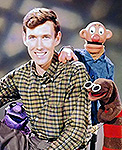 Sam and Friends Book
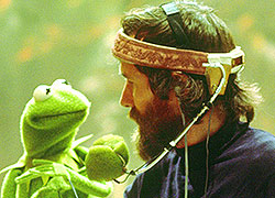 Jim Henson Idea Man
 Bear arrives on Disney+