New Muppet Central Site Design

SNLIM

Well-Known Member
Joined
Aug 18, 2002
Messages
100
Reaction score
0
the new design is absolutely awesome, i don't think that it could look better!
 

Kedrick

Well-Known Member
Joined
May 28, 2002
Messages
52
Reaction score
1
Just wanted to chime in and continue with all the praise for the new look! The site design is very visually appealing and I've had no difficulty navigate about to the different sections.


Great work to all involved!!

Clint
 

Fozzie Bear

Well-Known Member
Joined
Apr 14, 2002
Messages
13,375
Reaction score
154
Phil and Jamie

This is a website of VERY heavy duty proportions...or something like that, but you get the jest of it! :smile:

TOO KEWL!

Now, I'm off to hit refresh til I see Fozzie Bear!

Refreshingly yours,
FOZ
 

towels

Well-Known Member
Joined
Apr 17, 2002
Messages
450
Reaction score
1
Originally posted by Luke
I've finally hit the Penguin, i had to get through 3 doozer's and a joint Statler/Waldorf combination first though ! :big_grin:

I know what the secret is - unknown to even Phillip, Jamie has digitised a photo of himself and it comes up as a rare character in the arches. I saw it on like the hundredth refresh !
Gee, I got the penguin twice in only ten minutes of refreshing...
and I never saw Statler without Waldorf (or vice versa).
Actually, I don't think I saw Jamie either...maybe I'd better go spend another 10 minutes just hitting refresh...
 

frogboy4

Inactive Member
Joined
Apr 13, 2002
Messages
10,080
Reaction score
358
LOL! Fun fact about the bar - Statler and Waldorf are the only linked characters. Heck, they had to be! I'd be worried to hear what they'd have to say if I didn't.

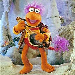
I hope to add a few more in the future, but we do have representations spanning Sam and Friends to Swamp Years. Thanx to Warrick for submitting a few key pictures I badly needed.
 

beaker

Well-Known Member
Joined
Apr 13, 2002
Messages
7,761
Reaction score
858
Phil...Jamie...I am in awe

I hadnt checked "Muppetcentral.com" minus the "/forum" Admittedly for a week. Then I decided to see what was new.

Holy 'insert word for pure astonishment'. This is exactly how I had always envisioned a Muppet site...just total eye candy, sweet layout, etc. The slot machine-esque refreshment of arches is insane...virtually ever sub group of Muppet and creature Shop is well represented...from the 'BIG 3" franchises of Muppet Show Sesame and Bear...to lesser known stuff. Even a penguin and Snowth or two is in there. Huge congrats...and I will say...

This site looks much better than ALL official JHC sites. Sorry JHC, but ya guys should hire this Jamie kid!

I now see a huge door opening for a new on par with Farscape magazine and Star Wars Insider glossy slick magazine to debut by next summer. I truly think if JHC wont roll out one, a few of us could be able to turn out something pretty darn close.

BTw...ALL THREE of my fave Muppets on ONE PAGE???
Jamie!!! On the FAQ there is Beaker, Pepe, and Digit!!!
You dont know how happyt hat made me to see all 3 of my fave Muppets on one toolbar opening...you guys are genuises!!!

 

Jaga828

Member
Joined
Apr 25, 2002
Messages
15
Reaction score
0
New Design

WOW!! Amazing job!! What a beautiful layout!! It's so well organized and user friendly. I hope the updated Muppet projects are as great as the new site design!
 

Stulz

Well-Known Member
Joined
Apr 14, 2002
Messages
560
Reaction score
35
website

Great looking site!!!

Great Job you guys!!!

Chris
 
Top