New Muppet Studios Logo

dwmckim

Well-Known Member
Joined
Apr 13, 2002
Messages
2,874
Reaction score
848
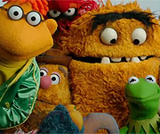
Well if these have been in existance since 2005, they've done a good job of keeping them hidden til now - maybe they've been seen a bit in the UK, but this is the first we're seeing them in the States and they are gorgeous. I'm doubly excited to see these and also a little insulted that these have been around for awhile and yet instead of using them until now, they've given us product after product of the Fugly Overused Posers. These get me excited - these look very classic and capture the spirit of the brand - these make me want to Buy Muppet. The previous FOP-based art make me want to keep my wallet in my pocket.
 

Muppetfan44

Well-Known Member
Joined
Nov 19, 2007
Messages
945
Reaction score
235
This new logo looks awesome; I can't wait until we start to see it on things!
 

frogboy4

Inactive Member
Joined
Apr 13, 2002
Messages
10,080
Reaction score
358
It's Disney merchandise artist John Loter's licensing clip art reconfigured into a new Muppet Studios logo so it is both old and new.
 

Drtooth

Well-Known Member
Joined
Apr 16, 2002
Messages
31,717
Reaction score
6,706
If they don't use these, then it would be a crying shame. These pics don't just scream Muppet, they Scream Jim Henson. And a lot better than the lame googly eyed purple thing, and the meh-looking "The Office" pastiche. I'd much rather see this at the end of any muppet projects than any of the other logos... Heck, I like this one much more than the weird 2003 vertigo logo.
 

unclematt

Well-Known Member
Joined
Dec 19, 2004
Messages
3,285
Reaction score
17
Oh God, I feel so bad. I don't love it. I looked at all the artists work and I think he is very talented and I feel awful that I dont love it. I am sorry.
 

frogboy4

Inactive Member
Joined
Apr 13, 2002
Messages
10,080
Reaction score
358
I think it's just one branding. I think they need stroger brand lettering that doesn't require Muppet "bugs" hanging off the logo.

Personally, this 2 minute mock-up from existing materials is closer to how I would handle the elements. I really liked the lettering, but not the colors, on the later Palisades packaging.
 

Drtooth

Well-Known Member
Joined
Apr 16, 2002
Messages
31,717
Reaction score
6,706
I really REALLY wish we could go back to the 2003 Muppet lettering... it didn't look as ugly as that loopy googly eye thing they had with the P's. Meshing the artwork and that specific lettering works wonderfully.

I'm hoping this isn't just a bunch of 2005 promotional stuff that got tossed aside waiting for the brand restructuring. This stuff really needs to see the light of day, and it would work wonderfully. I love this semi-silhouette style they went with (much better than posers- or worse, cheap photo compilations that don't match up) and I wonder if this guy did any other type of Muppet artwork that we'll soon see. His other stuff looks Maaahvolus!
 

unclematt

Well-Known Member
Joined
Dec 19, 2004
Messages
3,285
Reaction score
17
I guess maybe I just wish it had more color and would possibly not include Pepe. Sorry Pepe fans I just can't see putting him the logo. I love him and think he is hilarious but he is not an original Muppet. Just my thoughts.
 
Top