I mean, I liked "The Cookie Monster Nosh" from last year, as well as the "12 Days of Cookies," but then again, that could be my Cookie bias. I'll admit the lyrics for the former weren't all that masterful, but I still thought it was a pretty fun parody.
My main problem with the digital content is that they really don't tweak the Muppet footage in post as well as they should: the characters always look so dull and muted compared to the bright, colorful, and vibrant backgrounds they're super-imposed over . . . it's a tad disorienting . . . a little contrast and color saturation increase would be beneficial. I can be a little more forgiving with this one, since they're in Count's castle at night . . . but still, the matting isn't that great: are even the beds matted in? Because you can clearly see the chromakey affect around their heads in front of the headboards of their beds.

 Welcome to the Muppet Central Forum!
 The Muppet Show
 Sesame Street Classics on YouTube
 Sesame Street debuts on Netflix
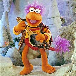 Back to the Rock Season 2
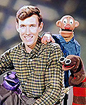 Sam and Friends Book
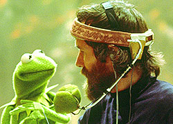 Jim Henson Idea Man
 Bear arrives on Disney+