"The Muppets" Teaser Poster

Drtooth

Well-Known Member
Joined
Apr 16, 2002
Messages
31,717
Reaction score
6,710
And I think the one thing we should stress is this is indeed a TEASER poster...

Sort of the vein of This Toy Story 3 poster That's not terribly impressive, but it tells us "There's a THIRD one! It's COMING!" and it doesn't even need to use the actual film title, much like this one...

Now, look at a final Toy Story 3 poster... a COMPLETELY different story.

So yeah, this poster is a nice start, and I'm sure we'll have something MUCH cooler by the time the film comes out.
 

douggy

Active Member
Joined
Sep 6, 2007
Messages
31
Reaction score
41
That's not the point though. It's the way the muppets here look that's the problem, they look like bad photographs of the muppet replica models. they look off, lifeless and weird. They look like props, photos taken of them stuck on their stands.
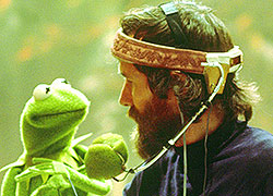
Look at this photo
http://collider.com/wp-content/uploads/jim_henson_muppets_01.jpg
Life, energy, fun, excitement, charm. Now look at the new one... stale. Everything is lost. No anarchy in the slightest, just really safe and really bland.

again, not trying to stir things up, you guys are brilliant, just saying my thoughts.
 

Beauregard

Well-Known Member
Joined
Apr 16, 2002
Messages
19,240
Reaction score
1,239
By all means stir things up! That's the whole point of everything! Stir like crazy, my friend! That's the only way that things get constructed and adjusted and encouraged to be better. Do not settle!

That said, I think a bunch of us (myself included...heck, I'm at the forefront of) are just pleased to see something new that we are investing our fan-heatbeats into seeing what is good in it (as well as the downsides, sure). Hence my seeing -- rather than the slightly CGI looking Piggy dress - her amazing new shoes and stunning ankles (but that says more about myself than the poster! Ha!)

But don't ever apologize for an opinion! I love that Jim/Muppets picture so much!
 

minor muppetz

Well-Known Member
Joined
Jun 19, 2005
Messages
16,073
Reaction score
2,660
I just started thinking... If this was still titled "The Greatest Muppet Movie Ever Made", would we have gotten a different poster? Because this is the blandest Muppet movie poster I've ever seen, and it would be very ironic if it had "greatest" in the title while being a bland poster.
 

frogboy4

Inactive Member
Joined
Apr 13, 2002
Messages
10,080
Reaction score
358
This isn't CG, but maybe the digital clean-up is a little too smooth.

It irks me that Apple takes the credit for any graphic design that features a colorful product against a white background. That's just basic design 101. However, Apple takes credit for a lot of things. It's how they stick around. (By the way, if you're considering an ipad, get the blackberry equivalent instead. It looks just as good and does a heck-of-a-lot more, but it doesn't have Apple's spiffy advertising team.)

I kind of think the mood of this particular ad is supposed to be less than cheery. This is not the poster, it's the teaser. Let's just say, this is showing the Muppets walking among us before being woken up and made aware that the new cool stuff is coming.

I know this is being over-analyzed to death, and I kind of like that, but I think it works great for its first teaser. This is the first note of a much longer campaign. They're not supposed to be all crazily mugging the camera yet. The joy will be represented in coming offerings and any thought that this is in CG will be squashed once the trailers come out.
 

Beauregard

Well-Known Member
Joined
Apr 16, 2002
Messages
19,240
Reaction score
1,239
They have even (on other forums and some sites) been described as Zombie-like. But, is that not slightly appropriate given that they are being brought 'back to life' here? That's why I love that the background is all blank, rather than a theater or city-scape or whatever they could have had there...because they can be coming from anywhere...the past...your imagination...

Also, notice how Kermit's mouth is totally closed...a pose that is unusual for him. They have not yet been given a 'voice' through a teaser trailer, or full trailer. They are setting the mood gradually. It may have been far too overwhelming to see them all acting crazy right away; especially for some audiences who may have NEVER seen the Muppets before. They wouldn't have understood why Fozzie had a banana in his ear, Animal was tearing through the poster or Piggy was attacking her frog. Slow and steady wins the race! And when they truly come to life...It Will Be Amazing.
 

frogboy4

Inactive Member
Joined
Apr 13, 2002
Messages
10,080
Reaction score
358
They have even (on other forums and some sites) been described as Zombie-like. But, is that not slightly appropriate given that they are being brought 'back to life' here? That's why I love that the background is all blank, rather than a theater or city-scape or whatever they could have had there...because they can be coming from anywhere...the past...your imagination...

Also, notice how Kermit's mouth is totally closed...a pose that is unusual for him. They have not yet been given a 'voice' through a teaser trailer, or full trailer. They are setting the mood gradually. It may have been far too overwhelming to see them all acting crazy right away; especially for some audiences who may have NEVER seen the Muppets before. They wouldn't have understood why Fozzie had a banana in his ear, Animal was tearing through the poster or Piggy was attacking her frog. Slow and steady wins the race! And when they truly come to life...It Will Be Amazing.
Exactly what I think. They're being tasteful, rather than presumptuous. It's a gradual stride of coming "closer" rather than bolting right out of the gate like other properties have done. They're giving us a quiet wink and a wave here. More is to come. :smile:
 

Beauregard

Well-Known Member
Joined
Apr 16, 2002
Messages
19,240
Reaction score
1,239
Quite unlike the Swedish Chef's food then...which tends to be much more presumptuous than tasteful.
 

Gonzo's Hobbit

Well-Known Member
Joined
Dec 21, 2009
Messages
1,597
Reaction score
181
I think they a look really good in this poster. The only thing that looks odd to me is the angle it's at. Everybody looks really really tall in it. I love the Muppets but tall usually isn't a word I associate with them. But as I said eariler that was my first initial reaction to it.
 

Beauregard

Well-Known Member
Joined
Apr 16, 2002
Messages
19,240
Reaction score
1,239
I too was surprised by their tallness. It was really nothing that I had expected. But honestly, I expected their first poster to feature just Jason and Walter!
 
Top