NEW Muppet Poster

Slackbot

Well-Known Member
Joined
Jun 14, 2010
Messages
3,543
Reaction score
3,155
Yay Photoshop!

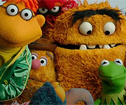
Beaker's eyes kinda weird me out; he's the only one not looking straight ahead. Walter looks pretty big. And what is the thing running diagonally between Statler and Waldorf? It almost looks like an arm.
 

TheMonsterAteMe

Well-Known Member
Joined
Aug 27, 2009
Messages
193
Reaction score
84
I like the one that actually says "THE MUPPETS" better rather than the one with just the big M! I feel like Jim would be proud of the direction that this movie is going! :jim:
 

Walter

Well-Known Member
Joined
Jul 8, 2011
Messages
434
Reaction score
230
i wonder if these are at DHS yet?
 

SSLFan

Well-Known Member
Joined
Apr 20, 2007
Messages
1,858
Reaction score
167
Reminds me of the poster used for Toy Story 3, lol.
 

Reevz1977

Well-Known Member
Joined
Jul 27, 2007
Messages
1,138
Reaction score
374
I'm gonna sound like a broken record but I really don't like these. The posers look so lifeless. The reason the Drew Struzan posters worked so well is they made the characters seem animated and not just a collection of lifeless puppets. Disney should be pull out all the stops with the marketing of this movie in order to to appeal to a new audience used to a CG saturated marketplace and I feel this is a really poor effort and a missed opportunity!
 
Top