New Muppet Central Site Design

Phillip

Administrator
Staff member
Joined
Apr 11, 2002
Messages
8,293
Reaction score
3,425
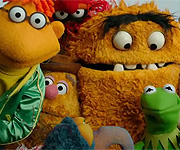
There are about 150 characters in the rotation. The further out from the center logo you go the more random and obscure the characters typically become. When Jamie and I were originally brainstorming ideas for the menu, I really wanted every character to rotate randomly and independently of the others. It kind of takes the random banners on our old front page one step further. Jamie accepted the challenge and after he did a ton of work, trial and error produced the fantastic result you see now.
 

frogboy4

Inactive Member
Joined
Apr 13, 2002
Messages
10,080
Reaction score
358
All the backgrounds were constructed and painted primarily in Photoshop. Some material is scanned but most (95%) of it is my creation - especially proud of the Sesame Street menu.
 

Zack the Dog

Well-Known Member
Joined
Apr 14, 2002
Messages
2,153
Reaction score
37
Amazing!

Take that Henson.com!!! Wonderful work Jamie and Phil!!!
I love how the page starts off with the old classic page and then the whole thing just falls apart, it's like saying good bye in a muppety way! great job!
 

Ol' Buddy Bert

Well-Known Member
Joined
Apr 15, 2002
Messages
173
Reaction score
2
Originally posted by Ol' Buddy Bert

"Phil, Cindy and all the other MC staff..."


Jamie...my apologies that I didn't congratulate you by name seeing as you've done the graphic work.

Anyway, excellent job, Jamie. I'm very, very impressed with your work.

regards,
 

frogboy4

Inactive Member
Joined
Apr 13, 2002
Messages
10,080
Reaction score
358
LOL! Didn't notice that. No problem. Glad you like it. :smile:
 

Smig

Well-Known Member
Joined
Apr 13, 2002
Messages
117
Reaction score
0
The new banners add a lot to the site! Good going, Jamie and Phil!
 

Gonzo

Well-Known Member
Joined
Apr 15, 2002
Messages
1,389
Reaction score
26
The New Look of Muppet Central!

Wow--I was just doing a drive-by, and saw the new look for the site....and I love it! I love the "transition" that takes us from the old MC to the new MC, and I can't wait to see all of the new goodies here. My favorite part right now is just seeing which of my friends is going to pop up in the arches next--I keep refreshing just to see who's going to be the Muppets I meet on the Muppet Central tonight!

Great job, folks! As usual...

Quinnnnnnnnn
 

Mayhem Diva

Member
Joined
Sep 8, 2002
Messages
24
Reaction score
0
I'm a newcomer, but I have to agree with Quinn. I was knocked out by the new look... and I love the "Moving Right Along" motif!

The animated arch-occupants are a triumph! :smile:
 

EmmyMik

Well-Known Member
Joined
Apr 13, 2002
Messages
1,386
Reaction score
31
I just have to say that new and different things scare me. This is new and different, but I am not scared (lol, I guess this is a compliment!).

Anyway, this looks fantastic!

Muffins for all!
 

Lynnette

Well-Known Member
Joined
Jun 3, 2002
Messages
79
Reaction score
3
That was such a cool surprise! Pretty slick keeping the news quiet. I entered the site as usual and started reading "Muppet Central Re-launch Goes Live". I thought, "Cool...but I don't see any difference." Then it all fell apart - so clever!!

The new site looks great! This is fun!

-Lynnette
 
Top