Poor Gilchrist interpretation. =)
The comic strip Muppets, after about the first half year of the run, became VERY simple yet very effective designwise, I would say ... (early on they were more complicated) ... but simplicity tends to be hard to copy and make it work. Would never work for comic books, where there needs to be more detail. Even Donald Duck became quite complex when drawn by the late great Carl Barks ... still, one could do worse than check that stuff out. I remember some Veterinarian's Hospital strips that were done, or was that early? Blog. I just gave all my Muppet strip books to Phillip. Maybe he'll do some scans of various characters as they appear in the Gilchrist strips and in the original Style Guide ... for the art inclined. I assume the MTM adaptation was bad. =)
If you do use some Gilchrist inspiration, include those three little crease smile lines on the side of Kermit's mouth ... look at any Gilchrist kermit to see what I mean ... it's always been shorthand for that style of Muppet art for me .... and there was a time when a lot of Muppet artists did it.
(Dad could do pretty good Muppet impersonations too ... Kermit, Fozzie, Animal .... I can sort of do his Kermit but it comes out like a bad Ernie somehow. Recently I watched the Requiem for a Dream DVD and there's a behind the scenes for the scene with the evil fridge who opens up its jaws, and that was done by a puppeteer who was doing a "rarr" voice the whole time and still had that Frank Oz sort of "puppeteer" voice! Even today all puppeteers seem to sound like that. So bizarre.)
 Welcome to the Muppet Central Forum!
 The Muppet Show
 Sesame Street Classics on YouTube
 Sesame Street debuts on Netflix
 Back to the Rock Season 2
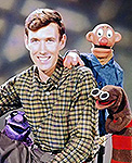 Sam and Friends Book
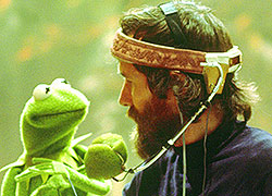 Jim Henson Idea Man
 Bear arrives on Disney+