• Welcome to the Muppet Central Forum!
    You are viewing our forum as a guest. Join our free community to post topics and start private conversations. Please contact us if you need help.
  • Christmas Music
    Our 24th annual Christmas Music Merrython is underway on Muppet Central Radio. Listen to the best Muppet Christmas music of all-time through December 25.
  • Macy's Thanksgiving Parade
    Let us know your thoughts on the Sesame Street appearance at the annual Macy's Parade.
  • Jim Henson Idea Man
    Remember the life. Honor the legacy. Inspire your soul. The new Jim Henson documentary "Idea Man" is now streaming exclusively on Disney+.
  • Back to the Rock Season 2
    Fraggle Rock Back to the Rock Season 2 has premiered on AppleTV+. Watch the anticipated new season and let us know your thoughts.
  • Bear arrives on Disney+
    The beloved series has been off the air for the past 15 years. Now all four seasons are finally available for a whole new generation.
  • Sam and Friends Book
    Read our review of the long-awaited book, "Sam and Friends - The Story of Jim Henson's First Television Show" by Muppet Historian Craig Shemin.

More Non-Muppet-Shaped Muppet Toys

Drtooth

Well-Known Member
Joined
Apr 16, 2002
Messages
31,717
Reaction score
6,710
Also, I don't think the Kermit coloring is to evade trademark. Pantone# 376 just seems like a brighter green than he should be. There was along Palisades conversation of that.

I never said that. It's clearly off color by accident. Like the paint dried too dark or something.
 

jvcarroll

Well-Known Member
Joined
Mar 27, 2012
Messages
1,660
Reaction score
1,999
I never said that. It's clearly off color by accident. Like the paint dried too dark or something.
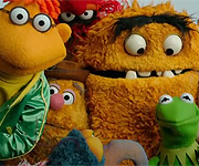
I thought someone said something like that. Yeah, it's a completely different shade of green. The pantone is 100% accurate, but doesn't take into account how light hits fleece. That gives a dimension and darkness to the color on screen. So basically Kermit toys of correct coloring look a little too lime-like.
 

Drtooth

Well-Known Member
Joined
Apr 16, 2002
Messages
31,717
Reaction score
6,710
Something tells me knowing the exact shade of green to use is a professional/style guidey thing. Even more evidence that these are customs.
 

jvcarroll

Well-Known Member
Joined
Mar 27, 2012
Messages
1,660
Reaction score
1,999
Something tells me knowing the exact shade of green to use is a professional/style guidey thing. Even more evidence that these are customs.
Yeah, it seems that they've used the busts to model these. The character selections indicate that too (no Sweetums, Robin, Rizzo or Pepe, but at least they remembered Floyd) and Sideshow Kermit s a darker green. :smile:
 

jvcarroll

Well-Known Member
Joined
Mar 27, 2012
Messages
1,660
Reaction score
1,999
Well, series two has been revealed...

I'll have to admit that their series one Rowlf was wonderful and Fozzie and Kermit were really cute too. Bunsen is definitely the winner in this bunch. They even went with a classic hue for his skin color. I expected that Beaker would be a tough challenge for this template. I just don't understand the Miss Piggy represented. I'm not keen on the likeness, but I find the frumpy dress, absence of pearls, lack of eyeshadow, gloves and shoes bewildering. It's like the sculptor had never seen Miss Piggy before. :mad:
 

Drtooth

Well-Known Member
Joined
Apr 16, 2002
Messages
31,717
Reaction score
6,710
That or he stylized it to high heck and back. Looks like the dress was supposed to be a Karate gi and they managed to screw that one up. Her head is far too wide to get the likeness to work remotely.
 

jvcarroll

Well-Known Member
Joined
Mar 27, 2012
Messages
1,660
Reaction score
1,999
That or he stylized it to high heck and back. Looks like the dress was supposed to be a Karate gi and they managed to screw that one up. Her head is far too wide to get the likeness to work remotely.
Nothing that makes her "Miss Piggy" is present here. It's awkward.
 

Drtooth

Well-Known Member
Joined
Apr 16, 2002
Messages
31,717
Reaction score
6,710
They got the eyes close and not much else. Maybe the ears.

The head shape really throws everything else off. It would look meh at best if it were correctly shapen, though. Stylization doesn't do a thing for the figure.

Of course, I like the Bunsen, but they really overemphasized his jowls.
 
Top