i've got to admit to initially being excited about these, but (except for Teeth) the art doesn't quite have the charm that it should. I've worked at translating designs onto urban vinyl so I get the attempt at simplification. The Little Big Planet people nailed a lot of the art whereas this is just kinda stale looking. I'll have to wait and see what they actually look like.
I agree about the Gonzo nose, but I actually really like that style and it can work for the Muppets. Just not like this. My problem with these is that they aren't using the same type of design as they did on the other Disney characters. This type of toy is for those who expect to see that sort of treatment. These renditions are watered-down and kind of look like the rip-offs you'd find in a Chinatown shop. That's what I'm saying. The Bobbleheads are for those who like a more traditional style. But maybe these are still in progress so I will hold judgment.That's the problem with stylized figures... they all have to have some uniform stylization to them. But it looks like the photo prototypes did one thing right, and broke out of the Little Orphan Annie eyes. Still... I don't see why Gonzo's nose is that weird color. Even if it was Muppet Baby-ized light blue, it would work better.
That Mahnah Mahnah and Snowth look fantastic, though...
Still, I'm ore excited about the bobbleheads. A Dr. Teeth Bobblehead! Amazing.
Thanks. Yeah. I'm seeing the same sort of ugliness with these that I see in some of the Vinylmations. Their Miss Piggy is so unappealing.Nail on the head specifically with Gonzo. Those larger eyes look much better.
I think that's the problem... they're trying to get the look and the style down, but it really seems they're playing it too safe. Something tells me they're just not quite stylized enough. Some of their other toys got by on bare likeness. The Marvel and DC comic ones were easy. Just slap the costumes on a one size fits all frame and it's easily recognizable. Even some of the other Disney characters they had basically fell on the same frame. Even the Simpsons were very very stylized, but recognizable.
This one seems to want to do it both ways... stylize but keep the facial likenesses instantly recognizable. They do need some tweaks, and no doubt we'll see some more of them before the final product.
Still, I noticed they have Beavis and Butt-head as well as Phineas and Ferb plain vynal figures with bases... I'd like to see that down the line.
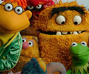
This is a huge improvement. I would prefer purple gloves for Piggy and the retrofit could use a little more finesse (especially in separating Animals pupils from the brow), but this is such a cool idea. I hope they continue this line!Here are updated shots of the actual figures. Pupils are still here, but whites are gone (for the most part): http://www.funkofunatic.com/forums/viewtopic.php?f=62&t=29313
I like that these match the POP! style more closely.
In other news, later in the thread it says that there is a series 2 planned, so fingers crossed for the rest of the Electric Mayhem. And Rowlf. And Scooter. And Bunsen. And Beaker. And Chef. And Walter. etc.
I think I need more fingers!In other news, later in the thread it says that there is a series 2 planned, so fingers crossed for the rest of the Electric Mayhem. And Rowlf. And Scooter. And Bunsen. And Beaker. And Chef. And Walter. etc.