Toyfair pics
Ken, I love all these new figures! They look great! I do hope you realize that they have a few problems though...mostly pepe and Janice...the rest are nearly perfect!
Here are the things I found slightly strange:
Janice's hat is way to big...it should be a little thingy that rests on the top of her head! Her lips are a bit too big and too bright red...it'd look perfect if you just dull them down a little. The belt is a really wierd color that doesn't go with her outfit...you should make it white rather than green. And her hair is kind of light...Janice's hair really is bright yellow unlike Miss Piggy. And finally for Janice...if you could just fatten her up a smidgen she'd be perfect...but my main complaint is DEFINETLY the hat being way too vertical rather than horizontal.
Gonzo-the hair looks amazing! Don't change that at all! The head sculpt is nice and he looks much better with no shiny on him. His nose is fantasticly painted as well! If you just dull the shiny yellow on the front a bit to blend in better I'd say that you'd have captured Gonzo perfectly.Camilla looks generally good...but she's a bit big, and she doesn't really convey that insanely insecure look she always has...its the eyes..they're just too wide! Gonzo's tux looks great...and I realize that the actual tux was that red...but maybe if you darkened it a bit it would look better? The "silk" lining of it right now sort of resembles a fire truck...but other than the yellow on Gonzo's nose, this is one of my favorite figures from Palisades yet! AMAZING.
Pepe-Well, pepe's body is excellent, but his face is really off...the eyes are far too big and they don't give him the smug and sleazy conceited pepe expression we all know...make them much narrower...and what about that cute little goatee under his chin? I didn't see that! Colors and hair are perfect though.
Muppet Newsman- I really love this figure...we never really have seen the lower body of this guy before have we? The upper half looks simply incredible...I love his perfect expression and colors...on the other hand, the lower body is kind of...well, freaky... It's alright I guess, but maybe if you just filled him out a little better and made him less cartoony, he'd be more likable...it's just that his legs are way too thin, if not too short. Colors are spot on and the hair and eyebrow sculpt are just perfect! LOVE IT!
Beau- The sculpt is excellent and I see no problems at all. I love the clothes he's wearing! nice shading and wrinkling. The only problem I see with this figure at all is the facial painting...he just seems so...flat! I think with a bit more depth and variation in his face, beau would be a work of art.
Statler- He's got a pretty good face going...but his upper lip is WAY too big and his nose is too small...same for his cleft chin. His paint scheme is great-no problems there, but his body is way too thin and cartoony. Maybe if you just made his body about a 30 % wider and his hands smaller? That'd be great-otherwise this figure is average if not good.
Waldorf- Waldorf looks really good. I like his face and his body just the way they are...he still is a bit cartoony, but if his hands were smaller, he'd be amazing.
Clifford sculpt...this was really dissapointing...I must say that he'd probably look much better with paint..but the body is really off...clifford's head and dreadlocks are supposed to be bigger than his torso! And his legs are just way too long for his body in this sculpt. I think if you shorten his torso a great deal and loosen up his legs so they aren't so incredibly stiff- we'd have a clifford...also his head is just too small and square! Make it fuller and rounder-actually make it more cartoony.
Chef with Lobster Banditos- I love the lobsters, but the chef just looks wierd...still deciding on this one.
Series 4 figures- wow! These certainly aren't a group of characters that I really like together...but the sculpts are just amazing! Pigs in Space couldn't be better and Rizzo is flawless other than his size-please make him smaller! Sam is wonderful-but maybe too big...still I have no problems with series 4.
Reporter Kermit- wow what a cool figure! It's sure to sell well. The Koozebane base looks pretty darn crowded, but good all the same- I hope they shade the koozebanians a bit better-they still look pretty flat and too light in color! The sculpts however on these babies are simply incredible. This is a great little package.
PVCs- WOW is the only thing I can say...they're so much bigger than I thought they would be! And soooooooo accurate! It's just an amazing phenomenon! (Doo DOOOOO doo DOOdoo)
Swinetrek Playset with First Mate Piggy- Well, I'll start by saying I love the playset, Link, and Strangepork. The ship just looks so cool! Opening doors and a screen with images that can cycle through! What could be better? The answer: Piggy. I just can't stand the figure! first of all...her outfit doesn't match Link or Strangepork at all, second, she looks like she's stoned, and third, why didn't they just reuse a head sculpt like Gonzo? The inconsistency really stands out and If the playset wasn't so cool, I don't think I'd buy this figure at all...besides, didn't she at least wear pants or a real skirt? I truly doubt she wore a pink sheet with a rope around her waist.
Jim Henson Muppet- Ken, I'm afraid to say it, but this may be the coolest thing ever done in the history of the universe! The pic looks perfect-just make sure to make the banjo fit into the kermit figure's arms so we can make up for that lost accesory eh? I hope the kermit puppet is at least big enough for a finger puppet!

I'm joinin the collector's club as soon as this one's out.
Well, there's my insanely long and uber-critical review! Good work! and just tweak the paint a bit in general where you need to!


 Welcome to the Muppet Central Forum!
 The Muppet Show
 Sesame Street Classics on YouTube
 Sesame Street debuts on Netflix
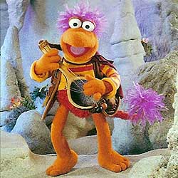 Back to the Rock Season 2
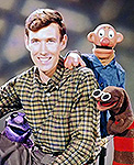 Sam and Friends Book
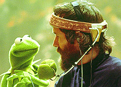 Jim Henson Idea Man
 Bear arrives on Disney+


 LOL! You know what's funny...the same people that groaned about Tux Rowlf are probably going to complain that they can't get the white tux version from the industry giveaway.