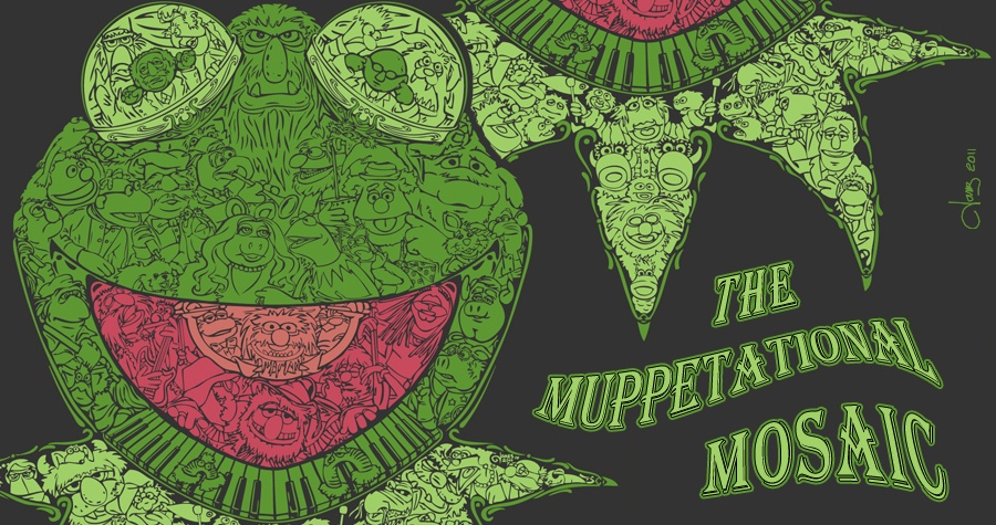
Please don't worry about that at all. I received my share of bad comments for last year's Muppetational Mosaic too! Let me transcribe my favorite one for you:
"OnASteek/Oct 6, 2011/2:10:23:
This piece of crap won? I thought this was one of the ugliest designs. I'm guessing it's because of the zoomed in pics. Yeah it's nice on a computer screen (in a sense) but on a shirt it's going to look like crap and anyone passing by you is going to think he has worms or something crawling under his flesh/felt. There are shirts with just that Kermit head with the right colored eyes where it won't look like Kermit has a festering, infectious skin disease."
The design actually looks very nice when printed. I've actually seen it around town, on a celebrity and in facebook photos around the world. The shirt has since sold-through multiple times and was very popular on print and canvas too!
We are the brave ones! As artists we put ourselves out there and we'll never get anywhere unless we do. Both criticism and praise should be taken in perspective. Sure, we create works for others to enjoy, but there's no way to make everyone enjoy it. Keep your head up!
________________________________
These votes don't mean a darn thing except for the fan-fave winner who will get the same prize as the 8 runners-up chosen by Henson. I'm certain they will look at ALL of the entries. Incidentally, my entry doesn't even make my personal top 5 (shhhh) and my picks wouldn't likely make many others' lists either.

My taste skews more toward these selections. It's all a matter of personal taste:

 Welcome to the Muppet Central Forum!
 The Muppet Show
 Sesame Street Classics on YouTube
 Sesame Street debuts on Netflix
 Back to the Rock Season 2
 Sam and Friends Book
 Jim Henson Idea Man
 Bear arrives on Disney+
 (Phraggle) !!! Congrats!!!
 My taste skews more toward these selections. It's all a matter of personal taste:


 Don't you know, I'm the S.H.E.! My entry ranks #34 in Highest Votes: