• Welcome to the Muppet Central Forum!
    You are viewing our forum as a guest. Join our free community to post topics and start private conversations. Please contact us if you need help.
  • Christmas Music
    Our 24th annual Christmas Music Merrython is underway on Muppet Central Radio. Listen to the best Muppet Christmas music of all-time through December 25.
  • Macy's Thanksgiving Parade
    Let us know your thoughts on the Sesame Street appearance at the annual Macy's Parade.
  • Jim Henson Idea Man
    Remember the life. Honor the legacy. Inspire your soul. The new Jim Henson documentary "Idea Man" is now streaming exclusively on Disney+.
  • Back to the Rock Season 2
    Fraggle Rock Back to the Rock Season 2 has premiered on AppleTV+. Watch the anticipated new season and let us know your thoughts.
  • Bear arrives on Disney+
    The beloved series has been off the air for the past 15 years. Now all four seasons are finally available for a whole new generation.
  • Sam and Friends Book
    Read our review of the long-awaited book, "Sam and Friends - The Story of Jim Henson's First Television Show" by Muppet Historian Craig Shemin.

NEW Muppet Poster

frogboy4

Inactive Member
Joined
Apr 13, 2002
Messages
10,080
Reaction score
358
Please stop picking on the puppet designs. It's depressing and annoying.
You have been reported because this behavior has persisted years after you've been asked to stop! :sigh:


Dude, stop trying to censor the posts of others. This sort of trolling is childish, irritating and borderlines on harassment! That is depressing and annoying. Criticisms like the one I made in this thread are part of what Muppet Central has been about since 1998! :attitude:

My comments don't mean that I don't support the Muppets or the poster. On the contrary, I love the Muppets a lot and have shown it through years of fan art and legit work celebrating the characters! :flirt:

I offered some positive remarks earlier in the thread, but I maintain that the Miss Piggy they used looks strange. I'm entitled to my opinion just like you are. This is a fan forum where we discuss the things we like AND the things we don't. It is your right to ignore the posts, offer a counter-point or leave if you can't handle conversation on the forum. :grr:
 

Frogpuppeteer

Well-Known Member
Joined
Aug 25, 2004
Messages
2,062
Reaction score
278
gotta admit i was one of the few who couldnt tell the difference in your poster fix up , till you pointed it out

but now i see the differnece and your piggy looks 100 times better
 

frogboy4

Inactive Member
Joined
Apr 13, 2002
Messages
10,080
Reaction score
358
gotta admit i was one of the few who couldnt tell the difference in your poster fix up , till you pointed it out

but now i see the differnece and your piggy looks 100 times better
It's a small tweak, but I believe that subtlety in design is one of the things that distinguishes the Muppets' quality above all else. She looks stretched out and kind of heavy in the cheeks there. It's kind of weird that the others look so good while the main pig looks a little off.
 

Bannanasketch

Well-Known Member
Joined
Aug 11, 2009
Messages
739
Reaction score
178
Duke, seriously, if you really think it's depressing and annoying keep it to yourself and ignore it. The members of MC Forums have a right to state their opinions and discuss issues they see. This is a place where discussion is encouraged and NOBODY should try to tall another member what they can or can't post just becuase of your own personal views. Therefore, I do agree with Frogboy's decision to report you.

Anyways, I do somewhat like the poster, but it could've been done a little better. Some of the characters are out of proportion. I do hope the other posters that come out look great and I'm confident they will.
 

Frogpuppeteer

Well-Known Member
Joined
Aug 25, 2004
Messages
2,062
Reaction score
278
It's a small tweak, but I believe that subtlety in design is one of the things that distinguishes the Muppets' quality above all else. She looks stretched out and kind of heavy in the cheeks there. It's kind of weird that the others look so good while the main pig looks a little off.
exactly so when you first posted it i wasnt thinking small but big and completely missed what you did
 

scottishpiggy

Well-Known Member
Joined
Feb 6, 2007
Messages
112
Reaction score
6
I know, right? I don't understand how anyone sees a pretty-looking Piggy in that picture. I still think she looks a little bit better in my doctored version, but some people can't tell the difference.
yeah i can see how youve lengthened her face, or at least reduced the cheek size- the altered version looks more like piggy, well done :smile:
 

Drtooth

Well-Known Member
Joined
Apr 16, 2002
Messages
31,717
Reaction score
6,710
I'm going to experiment with this poster too.... I think I just realized something...


Her face is slightly thinner, and her eye is at a slightly different angle? That it? it is subtle and I had to give it the unfocused eye test, but it does look better overall.
 

Drtooth

Well-Known Member
Joined
Apr 16, 2002
Messages
31,717
Reaction score
6,710
I'm going to experiment with this poster too.... I think I just realized something...

Her face is slightly thinner, and her eye is at a slightly different angle? That it? it is subtle and I had to give it the unfocused eye test, but it does look better overall.
Okay... here's my fixed up concept... the "Less is more"

Not extremely professional, took me minutes to do, couldn't think of a clever text, but now the characters look a lot less flat, and they seem to pop better. Bunsen, Teeth, Beaker, and especially Statler and Waldorf just cluttered up the composition, and looked pasted in... Animal has some depth to him, but not much... and in retrospect, I would have placed Walter next to Kermit at the top, behind the logo...

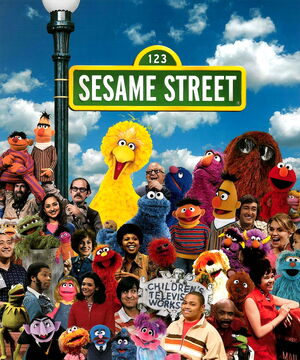
But I think I found the problem in those removed characters. The forced shadow and lack of depth in their placement made the poster clunkier than it should be. At least they managed to keep scale to an extent... I'd hate to see any more Muppet photoshop compilations that look like the 40th anniversary book cover...


Ah yes! Good old 6 foot tall Cookie Monster and 6 inch tall Herry Monster. And Roosevelt Franklin's head is the size of Grover's nose.
 

beaker

Well-Known Member
Joined
Apr 13, 2002
Messages
7,761
Reaction score
858
People at Sesame Workshop and Disney need some serious Photoshop basic lessons. Srzly.

also I'm glad they've kept Miss Piggy a bigger woman. There's virtual no representation of non skinny actresses or celebrity women in America, even though a large portion of women in America are bigger.
 

Drtooth

Well-Known Member
Joined
Apr 16, 2002
Messages
31,717
Reaction score
6,710
People at Sesame Workshop and Disney need some serious Photoshop basic lessons. Srzly.
I've brought this topic up before and I get the general fan consensus that NO ONE likes Muppets and Photoshop together. Sadly, the movie poster is one of the GOOD ones. Relatively, that is... Too many times they shove too many characters into too many posters and puzzles. I don't care if Angus MacGonacle is in a poster that he wasn't in before, nor do I want anachronistic Piggy heads superimposed on her body. I find that Sesame Street book cover the worst case. Cookie Monster looks like he's about to devourer Tokyo.

also I'm glad they've kept Miss Piggy a bigger woman. There's virtual no representation of non skinny actresses or celebrity women in America, even though a large portion of women in America are bigger.
She'd look absolutely horrible if she was done differently. I mean, Pigs aren't exactly svelt... even Spamala and Hasslehog were kinda stubby.
 
Top