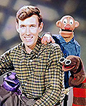
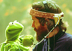
Jason Segel talks The Muppets and his inspiration

BobThePizzaBoy

Well-Known Member
Joined
Aug 25, 2007
Messages
1,688
Reaction score
476
I have agree with Drtooth, Pocahontas is a really disappointing film. I don't hate it as much as he does, Alan Menken's score was probably the most redeeming quality of the movie and some of the voice acting is satisfying, but it moves far too slowly and hastily put together as a result of Jeff Katzenberg's insistence on making what he viewed as an "Oscar-worthy" drama. Disney got much better with balancing drama and their traditional fare with The Hunchback of Notre Dame.
 

Drtooth

Well-Known Member
Joined
Apr 16, 2002
Messages
31,717
Reaction score
6,710
Ah, Katzenberg... the same guy who wanted Toy Story to suck.
 

dwmckim

Well-Known Member
Joined
Apr 13, 2002
Messages
2,874
Reaction score
848
About those advertising posters Disney's (hopefully) going to do for the new film. The Disney execs or the Muppet poser/photo people NEED to read Danny Horn's article about Kermit he did a while back. It's an excellent example of how Kermit can look awful if he's not posed and positioned just right, especially the head. Would someone there have a MR Kermit poser they could practice taking pictures of before using the real puppet?
Or better still, don't use the posers unless absolutely necessary for the shot. They don't work. The only thing worse than an ugly lifeless poser photo is a ubiquitous ugly lifeless poser photo.
 

Drtooth

Well-Known Member
Joined
Apr 16, 2002
Messages
31,717
Reaction score
6,710
Makes me wonder... What about developing hand shaped armatures? There's clearly something up with having the puppeteers stand there all day getting the right light and angle for a photo... but what if we put the actual puppets (or special photo puppets made similar to the actual puppets) on something like that, shape the hands from the outside to shape the mouth, and use that as a photo? it would make Kermit look a LOT better.

Still, what's worse than a poseur? Photoshopping a poseur where they shouldn't be.
 

Convincing John

Well-Known Member
Joined
Aug 27, 2003
Messages
1,243
Reaction score
195
Makes me wonder... What about developing hand shaped armatures?
I wondered that myself. Kermit's head is basically a mitten with either Jim or Steve's hand inside doing the expressions.

Check out what I found. You can get them on Amazon or in an art supply store. Artists use these wooden hands to make sure they get the proportions right. Like you said, can't something like this be invented for photo shoots? It wouldn't take much to have the photo people say "Hey, Steve. We gotta do a picture of Kermit thinking and looking up. How would that look with just your hand?" Steve could position his arm and hand where they should go, then the photo people would fix the fake arm to match, then put a real Kermit puppet on it. If Steve's not there, then at least study footage, photos, etc.

The posers from the Muppet Show days didn't look too shabby, but I think that's because they used the actual puppets for at least some shots. The Muppet Movie one of Kermit in the director's chair, plus the one of Kermit with his arms folded (a popular pose from the late 70's--see Kermit's mantlepiece in "Polliwog Ways") didn't look too bad. Obviously Jim was there back then and if something looked off, he would've went "wait a minute, let's fix this here."

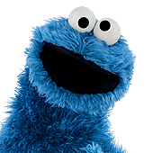
I agree, the Photoshopped Muppets just don't look right when just thrown together as a collage. All the Muppets need to be in the same shot together in order to make it believable. Otherwise, it just doesn't look right. When a collage is made, lighting is different from different photos, plus sizes can be off, too. A prime example of this is the Cookie/Herry pictures parodied in your drawing.

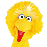
Obviously, Louis Mitchell at SW puts in a lot of effort with the poser photography and Big Bird or Elmo or whoever don't turn out looking strange. Is it because of certain lighting they use at SW? Do they just care more about how the characters should look in still photos?

If Disney reads this thread, well, here's my suggestion. It wouldn't hurt to ask Steve or Louis for their imput. Heck, even Frank might have a few words to say. Even though he's retired from Muppeteering, the guy knows the characters and how they should look. Get Michael Frith's imput, don't ignore Don's Magic Triangle, find photos or film of Jim or Steve performing. There's so much hard work that goes into these characters. The photos help advertise them. They should be done with care, not sloppiness.

The Muppets are making a comeback, yes, but fer crying out loud, don't screw up the publicity photos. The same goes for merchandise, which is a whole other kettle of fleece. Fisher Price got it right with their plush Kermit in 1978. Rowlf looks even better! Years later...this came out. Blechh.

Convincing John
 

frogboy4

Inactive Member
Joined
Apr 13, 2002
Messages
10,080
Reaction score
358
This is primarily a Kermit issue. Some of the poser pics have looked okay. There were even wonky ones in Jim's day yet there haven't been many good ones since. I think they should use a hand model. My guess is that the merchandising department believes photographic symmetry to Kermit's face is more appealing than true personality, but in my experience that's just not the case. :smile:
 

theprawncracker

Well-Known Member
Joined
Dec 14, 2004
Messages
13,202
Reaction score
534
That Kermit... he's such a poser. A real phony froggy.

This post has been brought to you by...
Nothing at All Industries
A Division of Completely Pointless, INC.
 

Drtooth

Well-Known Member
Joined
Apr 16, 2002
Messages
31,717
Reaction score
6,710
I wondered that myself. Kermit's head is basically a mitten with either Jim or Steve's hand inside doing the expressions.

Check out what I found. You can get them on Amazon or in an art supply store. Artists use these wooden hands to make sure they get the proportions right. Like you said, can't something like this be invented for photo shoots? It wouldn't take much to have the photo people say "Hey, Steve. We gotta do a picture of Kermit thinking and looking up. How would that look with just your hand?" Steve could position his arm and hand where they should go, then the photo people would fix the fake arm to match, then put a real Kermit puppet on it. If Steve's not there, then at least study footage, photos, etc.

Something like that... yeah. But maybe a bit more durable, and specifically tailored to being manipulated from inside a puppet (they still have to slip the thing on)... and of course, built up to get at the right angles.

Kermit's expressions lie in his hand shape. A lot of the other posers can live without that (though some need to be rebuilt, simple as that) but Kermit... Kermit has a slight skew in his face from where the hand points. That gives him more personality.
 

dwmckim

Well-Known Member
Joined
Apr 13, 2002
Messages
2,874
Reaction score
848
I'd say arm-shaped support is a step in the right direction but ultimately they won't solve the problems as they run much deeper than that and would be a case of addressing the symptoms rather than the cause.

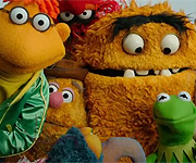
Before Henson really developed the poser puppets, most of the earlier photo shoots were done with the real puppets...either on an arm or in large cast shots, with them on stands. Yet even those shots with Muppets on stands with no arm in them looked better than most poser photos.

What is it that gives Muppets "life"? The puppeteer. How do puppets that usually don't have any type of facial features still manage to look happy, sad, confused, contemplative, etc etc? Via the skill of the puppeteer and their knowledge of how to move them and pose them in front of a camera. Poser Muppets by their nature can't take advantage of that...they have to be manipulated by the outside. The best poser photographer just doesn't have the appropriate tools to create something that has that same amount of life and expression. This is why poser photos always look dull and fakey. They're not only shooting understudy "stand-in"'s but ones that have been overly-Botoxed...incapable of registering emotion.

But even though that's the root of the problem, there are still other factors in play. (After all, that still doesn't explain why puppets on stands with no arm inside giving them expression still look better than posers)

Part of the problem is with the construction of the posers...the stuffing inside, the generic expressions they're built with. Though they may be a close match, they look different and the difference is always worse.

And at this point, i'm going to say something very unpopular and i'm about to lay major criticism on a longtime valued employee of Henson. But John E. Barrett's whole style of photography is just a poor fit with the Muppets. Sure the guy's been in charge of poser photography for decades and he's been entrusted with that task, has had exhibits of his work and won numerous awards and while the photos themselves may be well-done as photographs, they still do not compliment or capture the essence of the Muppets. The problem is that his entire style is based on both trying to make something fake look like something real as well as trying to make it "fit" into the square peg of 2d still image...the latter is why Kermit has traditionally been the worst looking poser year after year, rebuild after rebuild. Both photographer and poser builders try to make his unusual head shape look more "head-on friendly" - looking more like a cartoon drawing simplification, hence what always ends up being that flat-head look.

Poser photography, under Barrett's watch, is a method of making substandard already poor-looking Muppets try to duplicate the real things. But the end result is that so much emphasis is placed on the artifice that they miss capturing the soul of what they're trying to duplicate. The photography "expert" frequently misses the larger picture, so to speak. As Cantus the Minstrel would say, Barrett "looks, but he doesn't see."

It doesn't matter if the photo in question is full-body or from the waist up. Actually those waist-up photos are worse because they really highlight how they aren't the actual Muppets they're trying to pass them off as - you can see how bad it was from the debut issue of Muppet Magazine. The cover had that flathead generic "fixed expression" Kermit that would plague the poser Kermit's for decades and a very ugly Fozzie (which looked really bad compared to the puppet version that existed at the time). Within those pages, article after article just looks "bad" or "wrong" with the worst being the Vet's Hospital feature where they do a quasi cartoon with photography serving as the panels instead of drawing with the poser Muppets posing with Susan Lucci. The Muppets look stiffed and well..."posed" instead of full of life. The whole essence of the photos are too focused on trying to serve as a substitute that they miss what makes the real things the special things they are.

Barrett was too good at his task. Unfortunately his task itself was all kinds of wrong; a fool's errand and ill-defined. His work was akin to those who photograph food for menus, commercials, and print ads - they rarely use real food because real food melts under lights, have visible grease, etc. There's a whole side-industry in "food" photography that's designed to make the viewer desire the food pictured. But you sure as heck wouldn't want to eat what's in the picture because it's not real. Poser photos are equally as "un-appetizing". They may make the subject matter look idealized and more "appealing" but they take away the whole basic elements that made people desire what's supposed to be represented in the photographs to begin with.

Should poser photography be done away with? No, there was after all reason for its creation - to get certain types of shots one couldn't get with the real Muppets. But they should be reserved for those cases. The ratio needs to be reversed...instead of over 90% of Muppet photos being done with posers, it needs to be the other way around. It needs to be a tool in the overall arsenal, not the entire toolkit itself.

They also need some skilled photographers to add a fresh perspective and re-invent the wheel, undoing all of the damage that Barrett's "leadership" has done. His apprentices learn his technique and style which draws them further away from the actual true source that it's supposed to be representing.
 
Top