Muppet King Arthur

dwmckim

Well-Known Member
Joined
Apr 13, 2002
Messages
2,874
Reaction score
848
Even though there's no indication TMS #3 got delayed a week anywhere (including Boom's website), TMS #3 was on the new releases shelf today along with Muppet King Arthur #3 and Farscape (ongoing) #5.
 

Drtooth

Well-Known Member
Joined
Apr 16, 2002
Messages
31,717
Reaction score
6,710
I'm gonna have to check up on King Arthur... I didn't see it yesterday. Maybe my local comic shops just happen to have ordered them a week after their release... Of course, if that Flood could have affected the distribution (which I doubt). But then I only went to one story yesterday. I'll try today or tomorrow or something.
 

ohtherain

Well-Known Member
Joined
Mar 26, 2009
Messages
105
Reaction score
2
is it just me or do the colors seem a bit dark in here?
Fozzie's more brown than orange, Bunsen's a darker shade of green, and it's hard to make out Rizzo from the background.
I know that this is placed in the Dark Ages, but it wouldn't hurt to brighten up some of the colors and make the Muppets pop out a bit against the dark colors.
I dislike the Fozzie design. Something about him seems ever-so-slightly off other than the coloring...maybe googly-eyes?
But it's a very enjoyable comic! Maybe even funnier than TMS! And I noticed Pepe in the audience of the second issue...with green hair!
 

Drtooth

Well-Known Member
Joined
Apr 16, 2002
Messages
31,717
Reaction score
6,710
I don't know why I didn't find it at the comic store Wednesday, but I found it yesterday at a different location of the same chain. A More local one at that.

I gotta say, I'm probably the only one really liking this guy's style. But I do agree the coloring is pretty dark the first couple of pages. I think that's also due to the unfortunate translation of the ink to the paper (which was a respectable economic movie to keep it at the 3 dollar range)... because it looked a LOT darker in person.

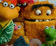
I have to say, the artwork here (and I said this on Prawncracker's Blog) looks the most like an actual comic book. Amy, Shelli and Dave's work looked like animated cartoons (not that there's anything wrong with that, of course) and Rodger's is definitely a Comix style. But there's just something about James's style that gives it a hint of Marvel...Plus, I think he REALLY got Pepe down great, and I love how he draws the Electric Mayhem.
 

blackaerin

Well-Known Member
Joined
Jan 23, 2010
Messages
145
Reaction score
131
I gotta say, I'm probably the only one really liking this guy's style. But I do agree the coloring is pretty dark the first couple of pages. I think that's also due to the unfortunate translation of the ink to the paper (which was a respectable economic movie to keep it at the 3 dollar range)... because it looked a LOT darker in person.
oh, don't get me wrong, Tooth, I love this guy's style as well. His Fozzie could use a little bit of tweaking (he looks more like the early Muppet Show Fozzie puppets with the bony cheeks and the slightly dopey eyes), but overall, i agree with the feeling of it being like a proper comic.
I just feel that the coloring i've seen so far in the previews doesn't give the art much justice.

I love how he draws the Electric Mayhem.
reading that makes me all kinds of happy! :big_grin::sing::flirt:
 

Drtooth

Well-Known Member
Joined
Apr 16, 2002
Messages
31,717
Reaction score
6,710
I hate being the guy who says this, but does anyone know when King Arthur 4 comes out?
 

Drtooth

Well-Known Member
Joined
Apr 16, 2002
Messages
31,717
Reaction score
6,710
Good. That way it doesn't get released same time as the Fraggle one. I'd hate to see fierce competition between Jim Henson brands. Plus I don't have to scramble up 7 bucks tomorrow to get both...

I don't trust waiting until weekends anymore.
 
Top