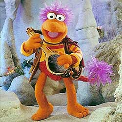
MINDstyle to make 25th Ann. Fraggle figures!

frogboy4

Inactive Member
Joined
Apr 13, 2002
Messages
10,080
Reaction score
358
Excellent, they all look fantastic, i'll definitely buy them. I thought Sprocket and Trash Heap worked ok as just heads as it kinda blends in as they werent tall anyway, but something about Pa Gorg unsettles me. Sculpting on him is perfect but maybe the Gorgs would have been better full body but just a bit taller than the Fraggles - its not like these had to be in scale as the Doozers arent.
I agree with you. I think the ratio came from the blind boxing concept. They had a certain height and width to work with so that each piece could fit in the same size box.

I still feel they were thinking too small with these figures. I think they should throw in a few mini facades (flat unarticulated playsets) like a cave, the entrance through Doc's workshop, the Gorg's garden and one for Doozers. They could be made on a very tight budget like the Simpsons.
 

Fozzie Bear

Well-Known Member
Joined
Apr 14, 2002
Messages
13,375
Reaction score
154
My plan to fix the Gorg-head thing is to create some kind of "bush" or wall for them to 'peek over' at the Fraggles.
 

CoOKiE

Well-Known Member
Joined
Feb 25, 2004
Messages
747
Reaction score
24
Very nice! I like Uncle Matt and Red the best... it looks like Wembly still needs to be worked on... and i'm not happy with Boober... its Booberish.. but i'd like him more open. And i'm not crazy for the fact that Gobo (my favorit) is sitting down. I'm being picky.. i know... the sculpt is great... but i'd like to see him standing.

They all look like they'd be great if you have them in a scene pose, however if you were to buy some of them on their own... i just dont think it works.

Over all.. i'm VERY happy with how they look
 

Redsonga

Well-Known Member
Joined
Feb 7, 2008
Messages
4,167
Reaction score
82
*has her heart set on a stop motion animation epic rolling Pa head youtube thingie*
*cleans her imagination with a good book and goes back to bed* :stick_out_tongue:
 

wwfpooh

Well-Known Member
Joined
Feb 4, 2004
Messages
5,424
Reaction score
64
*has her heart set on a stop motion animation epic rolling Pa head youtube thingie*
*cleans her imagination with a good book and goes back to bed* :stick_out_tongue:
LOL! But in all seriousness, despite the lack of playability, these figures are awesome!
 

Drtooth

Well-Known Member
Joined
Apr 16, 2002
Messages
31,717
Reaction score
6,707
I agree with you. I think the ratio came from the blind boxing concept. They had a certain height and width to work with so that each piece could fit in the same size box.
That and they wanted some sense of Scale, though it's clearly not fully accurate. Of course, if they wanted a fuller body to fit in a box, they could have made the figures in pieces that you snap together (Similar to Gentle Giant's Simpsons Busts).

I like these and all, and I will definately get as many as I can afford... but I still think they should have a different concept for the box, be it a plastic window, different Box art, or a lable on each package saying the character inside.
 
Top