While I love the new material and look of the site I would have to agree with you. The site is somewhat useless and not interactive. How many times can you log-on to see the same skits? In the marketing world this effort wouldn't really register.
I see this as a good start. Let's face it; most entertainment sites aren't very well designed. This one has substance, somewhat frequent updates and an attractive enough style that relates to the rest of the Disney umbrella of properties. I see this as Kermit sticking his flipper in the water. It's also a much more serious effort than anything past.

Muppetworld had such high promise, but Henson Interactive let it die on the vine before anything could ripen. Heck, this has video clips - old and new - with the Muppets as themselves behind the scenes (like the backstage of the Muppet Theater where most antics took place) doing what Muppets do. That's exactly what was needed. When more areas, games and -most importantly- doors open on the site I think we'll be pleasantly surprised. I don't think the point is to be blown away...simply entertained by Muppetyness. Such Muppetyness, I might add, has not been seen like presented here since The Muppets Celebrate Jim Henson special - in my opinion.

I don't see anything disappointing about the site thus far - just possibilities. Yeah, as a designer I would do some things differently. What the hey, I might even consider applying for such a position in the future. My only concern with the site is that they continue to update it frequently and freshen things up from time to time. It appears that's their active intention for the time being.


 Welcome to the Muppet Central Forum!
 The Muppet Show
 Sesame Street Classics on YouTube
 Sesame Street debuts on Netflix
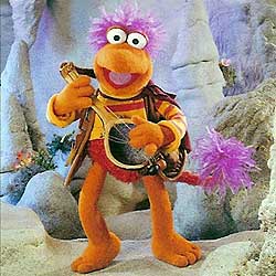 Back to the Rock Season 2
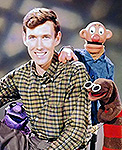 Sam and Friends Book
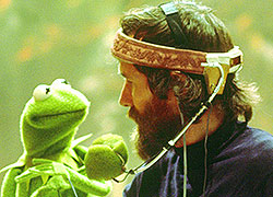 Jim Henson Idea Man
 Bear arrives on Disney+


 , it means any new addition of Muppety goodness.