I have absolutely no idea where to put this, maybe it should go in the Merchandise folder..
But anyway... I know we have this discussion from time to time, but what the heck is up with all those pieces of merchandise, calendars, books, posters... that take a base photo and just cheaply and quickly photoshop characters who weren't in there to begin with, often times in the wrong lighting and in some cases, the wrong scale?
Now, I was looking at the 40th anniversary coffee table book I got for Christmas, and while giving it a very good look it seemed like some of the characters were added last minute. An overly large Cookie Monster in the middle of the book, and the last minute addition of Herry (who I actually thought WAS Stinky the Stinkweed, and just didn't look closely enough) who was about a fraction of his usual size in comparison to the other characters. I actually drew something as an editorial if you check my account out.
Now, I like obscure characters as much as anyone else, and I love them getting the nod. But that doesn't mean I like to see an out of place Angus McGonacle crudely inserted behind Miss Piggy in a 1976 promotion shot. We've been getting this stuff for years, now... remember the Uno set with the Swedish Chef holding half a broken whisk?
Why is it that we don't get more unaltered rare photos or even new poser photos in merchandising anymore?

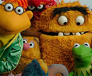 Welcome to the Muppet Central Forum!
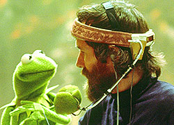 Jim Henson Idea Man
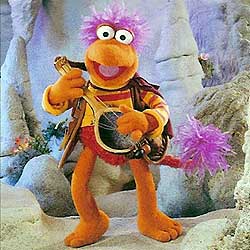 Back to the Rock Season 2
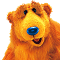 Bear arrives on Disney+
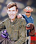 Sam and Friends Book