 Welcome to the Muppet Central Forum!
 Back to the Rock Season 2
 Sesame Street Season 54
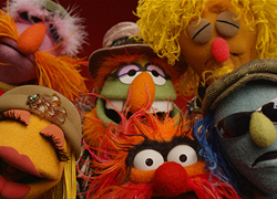 The Muppets Mayhem premieres
 Bear arrives on Disney+
 Sam and Friends Book
Absolutely. There's something about when things keep going advance, it takes away the imperfections that give something a little personality. It's no one's fault, it's just something that progresses naturally.
For the longest time I had some trouble with digital animation. Not Flash or Toon Boom, I'm talking when cartoon shows were colored on computers instead of cels. I think the problem was that some studios did it right, and some were on a learning curve. They didn't seem to have the warmness or the unique look of what cels could do. Then of course I quickly got over it. It was a great advance for television animation, and after the muddy looking hiccups, this freed up fuller animation and a cleaner look. I still miss cels to an extent. These things just happen over time.
Though I will say that next time these characters are due for a rebuild, they need to go back and look at some of the 80's character models.
