In all honesty, I really don't know how I feel about this poster. I THINK I love it but I'm really not sure...it's weird. I think I love it because it's the Muppets and they look so...alive. I must have looked at it in excess of 100 times so far today. I guess the mixed feeling comes from the fact that it's so far removed from what I was expecting I suppose. I still really dislike the new logo though - that I am certain of...and kermits inner thighs look odd. I really don't know peeps, I'm confused...HELP!
A technical discussion! Cool!
(Please don't think that this means I don't love the poster. I do, but I also dig picking apart the construction of things. So please, no flames people. Thanks!)
Kermit's the only one that really concerns me on the poster. He's kind of stiff, flat-headed and they really should have Photoshopped his odd-looking poser thighs a little bit. I think the Disney team is still learning, but that curve is tightening up a whole lot more these days.
Gonzo looks great. It appears that his nose will officially be fatter now, but he's also back to his classic sweater rather than that chili pepper suit he's been stuck in for over a decade. It always reminds me of the Arsenio Hall era of fashion. I could go off onto a long tirade of why they dressed him that way.
Miss Piggy looks pretty good. Heftier and that's okay with me. They finally got Animal looking good. Just the right amount of matte to fluff ratio with the hair. Fozzie looks like Fozzie.
The logo is growing on me. I get it. I just don't like it all that much. Maybe the casual fan doesn't see this, but it always looks like Kermit's back is turned to us because of the spacing of the points. On the other hand, it is very Monsters Inc looking and palatable for the youth market. It's an effective branding tool. I just hope it's not the only one they're using in the Muppet branding arsenal. It does come off as art-schoolish. I prefer the classic logo and always will. I also liked what they did with the lettering in the Palisades era when they fused the classic lettering with modern typography. Everything since has been blah.
I'd really like to see your poster! How's that comin?

 Welcome to the Muppet Central Forum!
 Back to the Rock Season 2
 Sesame Street Season 54
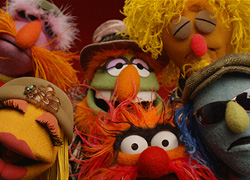 The Muppets Mayhem premieres
 Bear arrives on Disney+
 Sam and Friends Book
 {I may have a dictionary/theosaurous here}regard